Don't Use Spider Charts
A couple of days ago, I took the “Big 5” personality test on FiveThirtyEight, and I got these results:
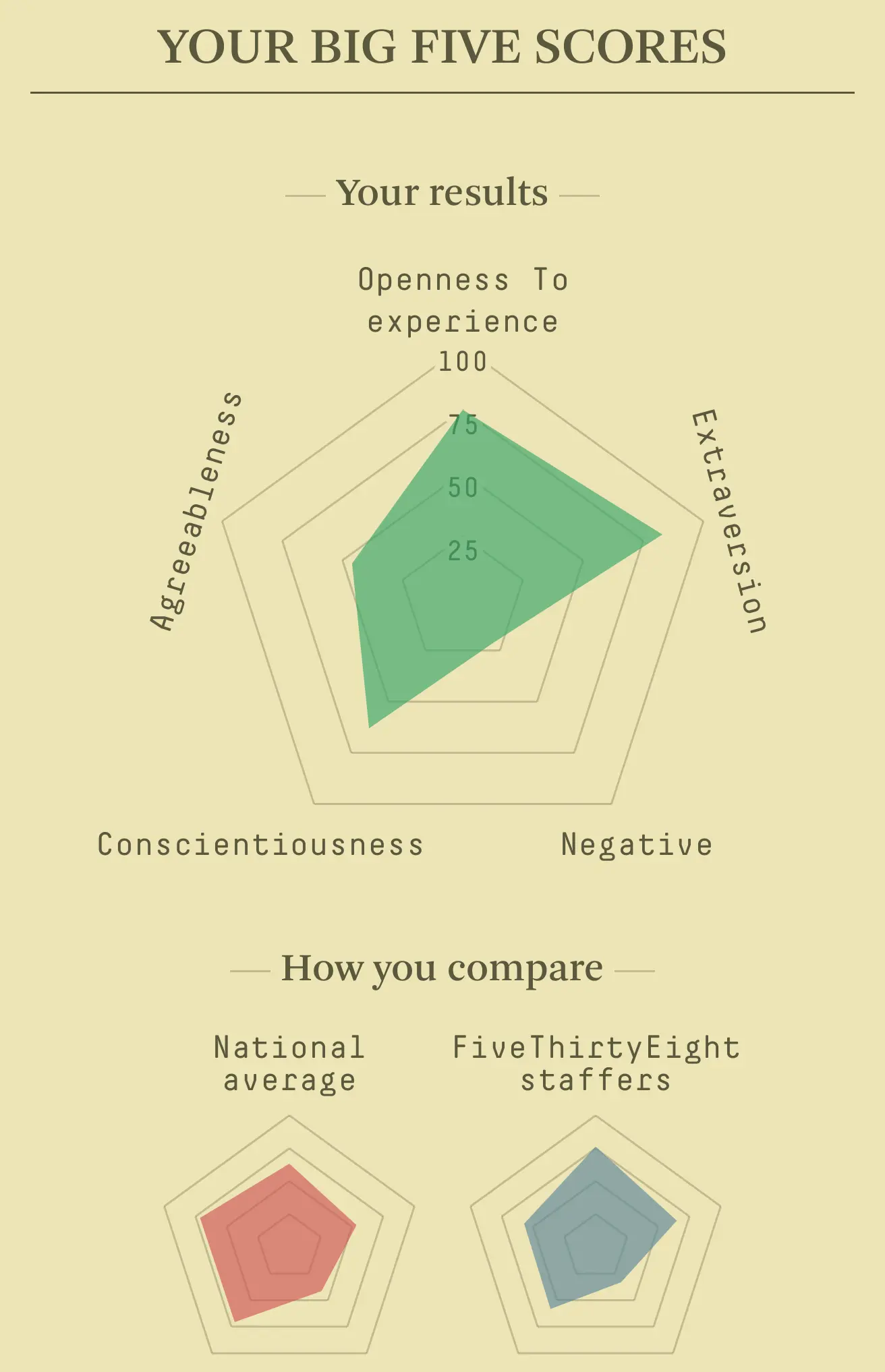
Which reminded me how much I hate spider charts. Spider charts are almost always better visualized as some variation of a bar chart (see below). Here are the problems I have with spider charts:
-
Hard to compare the difference between categories
-
Categories next to each other on the wheel seem and “feel” as if they are related (by creating an area between the two wheel spokes) even though they aren’t
-
It’s hard to compare many individual results without either creating a “spaghetti bowl” chart or making one chart per individual
To prove my point, I remade the visualization in a few minutes. It’s not as pretty, but it’s certainly more readable:
